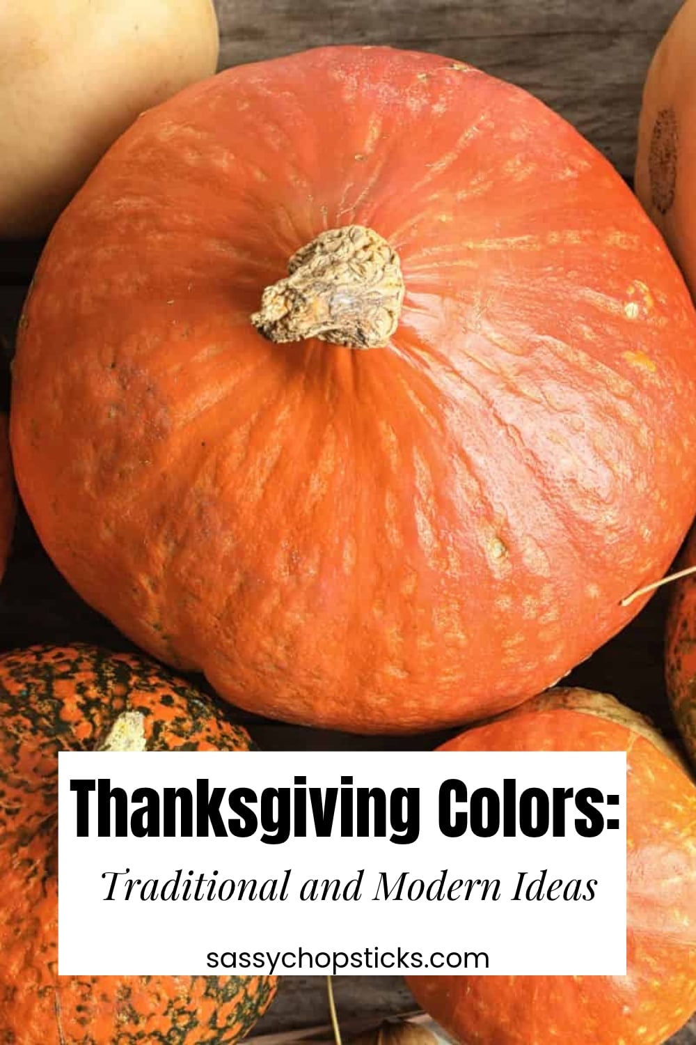
Thanksgiving has always felt like one of the coziest holidays of the year. The table is full, something comforting is cooking in the kitchen, and the last golden leaves of autumn are hanging on outside. It makes sense that traditional Thanksgiving colors borrow so much from the season.
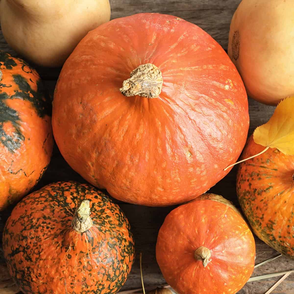
Warm orange, rich brown, golden yellow, burgundy, and earthy green are the colors most often associated with Thanksgiving. But your Thanksgiving color palette doesn’t have to stop with the classics. Cream, sage, terracotta, dusty blue, and other muted tones can give the holiday a fresh, modern look while still feeling warm and welcoming.
Whether you’re planning your Thanksgiving table, decorating the house, or coordinating family outfits, choosing a few colors ahead of time can make everything feel beautifully pulled together.
What Are the Traditional Thanksgiving Colors?
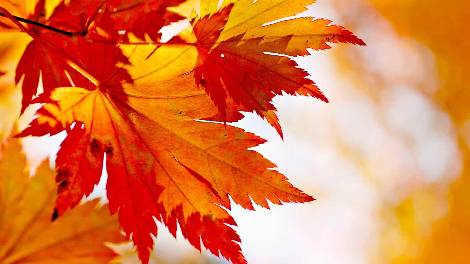
The classic Thanksgiving colors are orange, brown, yellow, deep red, and earthy green. These shades reflect what we naturally associate with late autumn, including changing leaves, pumpkins, harvested crops, and warm seasonal foods.
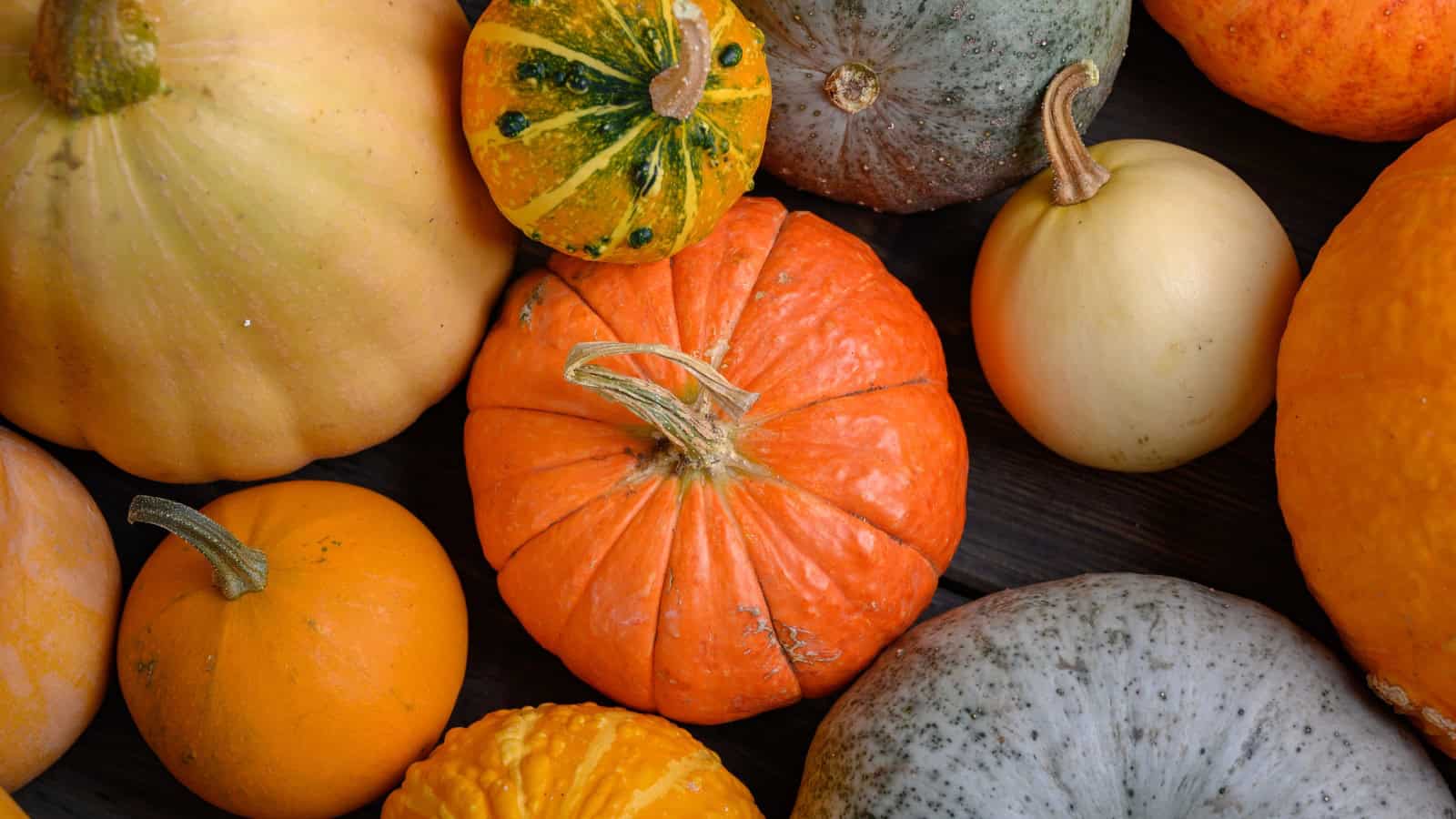
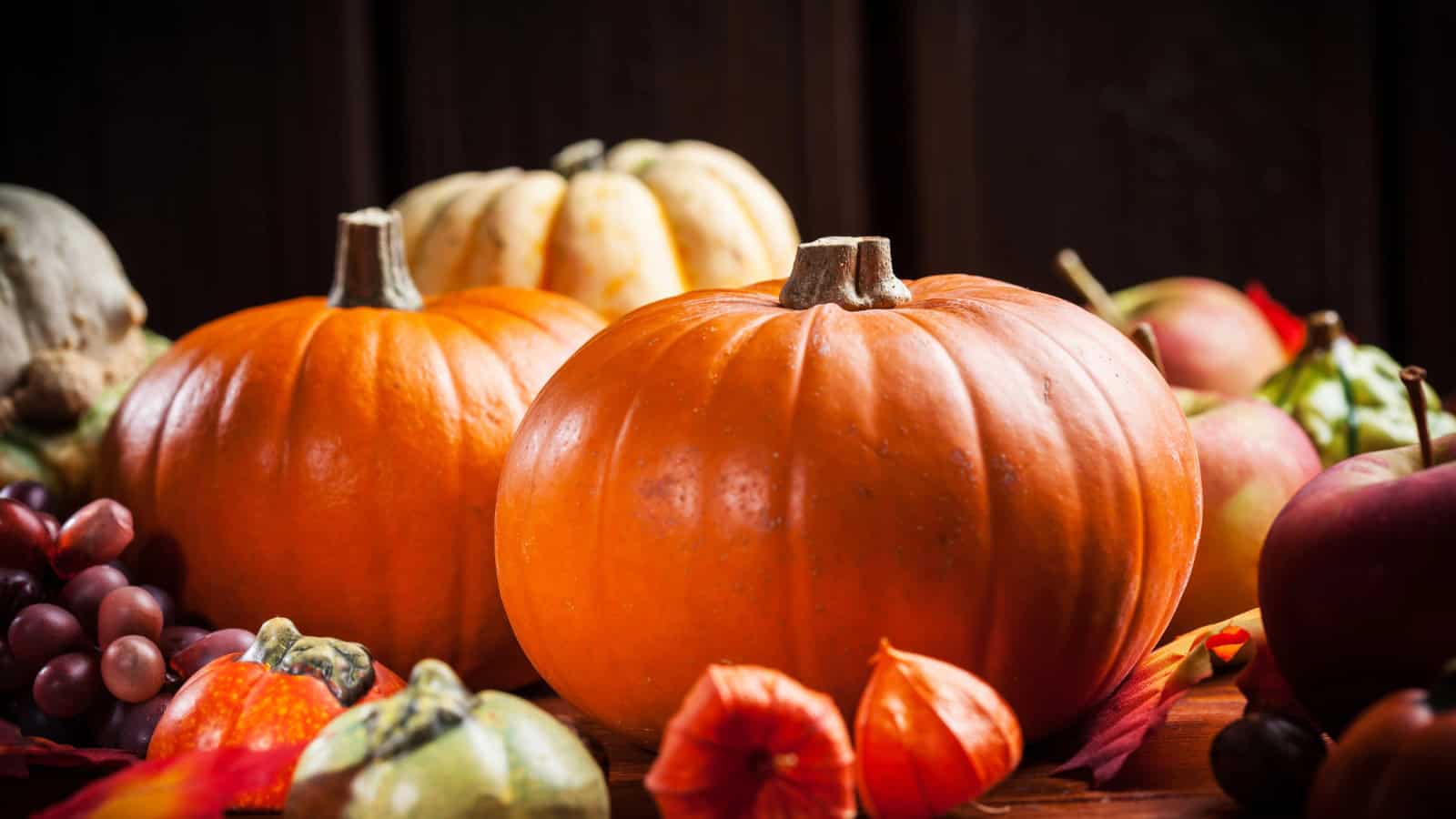
Orange is probably the most recognizable Thanksgiving color. It brings to mind pumpkins, sweet potatoes, squash, and autumn leaves. Brown adds an earthy feeling through wood, pinecones, baskets, branches, and natural linens.
Golden yellow adds warmth and brightness, while deeper reds such as cranberry, burgundy, rust, and maroon make the palette feel richer. Muted greens round everything out and bring a little freshness to all those warm tones.
Together, these colors create that familiar classic Thanksgiving feeling without needing elaborate decorations.
A Classic Thanksgiving Color Palette
If you love a traditional holiday look, start with pumpkin orange, golden yellow, warm brown, burgundy, and cream.
The deeper autumn colors make a room feel cozy, while cream prevents the palette from becoming too dark. It’s an easy combination to use because so many natural seasonal decorations already come in these shades.
Mini pumpkins, autumn leaves, wooden serving boards, dried flowers, baskets, and seasonal produce can all become part of your Thanksgiving decor. You don’t need every orange or brown to match perfectly, either. Slight shade differences often make the setting feel more relaxed and natural.
This is especially lovely for a Thanksgiving table because the food itself fits right into the color palette once dinner is served.
Modern Thanksgiving Color Palettes
Traditional orange and brown are beautiful, but they’re certainly not the only Thanksgiving color palettes you can use.
For a softer, modern look, try sage green, cream, terracotta, and natural wood. Sage keeps the palette fresh, while terracotta adds enough autumn warmth to feel appropriate for the holiday.
Another pretty combination is burgundy, blush, cream, and muted gold. It feels a little more elegant while still having the rich tones we associate with fall.
If you love neutrals, try ivory, taupe, warm beige, soft brown, and greenery. You can create a beautiful Thanksgiving setting without using orange.
Even dusty blue can work surprisingly well when paired with copper, cream, brown, or warm wood. The secret is to include a few warm elements so the overall palette still feels connected to autumn.
Is Green a Thanksgiving Color?
Yes, green is definitely a Thanksgiving color, particularly when you choose softer or earthier shades.
Olive, sage, moss, eucalyptus, and forest green all look beautiful alongside traditional autumn colors. Green also gives the eye a break from all the orange, brown, and red that tend to dominate Thanksgiving decor.
For a modern Thanksgiving color palette, sage looks lovely with cream, terracotta, and warm wood. If you prefer something deeper, forest green pairs beautifully with burgundy, brown, and muted gold.
Green is also one of the easiest colors to bring to the table naturally. Fresh herbs, eucalyptus, leafy branches, and other simple greenery can add color without making the table feel overly decorated.
Is Maroon a Thanksgiving Color?
Maroon works beautifully for Thanksgiving. Its deep red-brown tone feels warm, rich, and very much at home with an autumn palette.
Pair maroon with cream and muted gold for an elegant look, or combine it with pumpkin orange, brown, and mustard for a more traditional Thanksgiving color scheme.
Burgundy, cranberry, wine, and rust-colored reds can create a similar effect. These deeper reds feel especially appropriate in November because they’re less bright than the classic red we tend to associate with Christmas.
A little goes a long way, too. Maroon napkins, candles, flowers, or serving pieces can add richness without taking over the whole table.
Is Yellow a Thanksgiving Color?
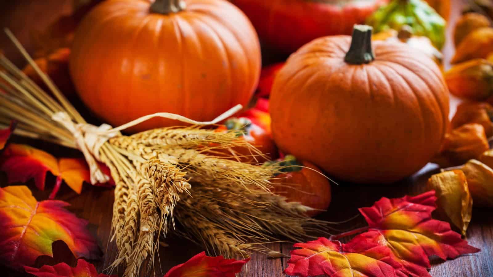
Yellow is another traditional Thanksgiving color, especially in warmer shades such as mustard, ochre, amber, and gold.
These colors remind us of autumn leaves, dried corn, wheat, and that golden late-afternoon light that makes fall feel so cozy. Yellow also brightens palettes with lots of dark brown, burgundy, or forest green.
Instead of bright lemon yellow, choose warmer, muted tones if you’re going for a traditional Thanksgiving atmosphere. Mustard paired with brown and cream feels rustic, while muted gold with burgundy can look more elegant.
Thanksgiving Colors for the Table
The Thanksgiving table is one of the easiest places to experiment with your favorite colors because you can build the look gradually.
Start with something neutral, such as a cream tablecloth, natural linen runner, wooden table, or simple dinnerware. Then introduce one or two stronger colors through napkins, candles, flowers, serving dishes, or a centerpiece.
For a traditional table, mini pumpkins with burgundy napkins, greenery, and warm wood create an easy festive look. For a more modern look, try cream dishes with sage linens, greenery, and a few terracotta accents.
You can even let the food do some of the decorating. Golden dinner rolls, orange roasted squash, red cranberry sauce, green vegetables, and pumpkin pie naturally bring beautiful autumn colors to the table.
That slightly imperfect mix of food, dishes, and seasonal decorations often feels much warmer than trying to make everything match.
Thanksgiving Colors for Families and Outfits
Choosing Thanksgiving colors for families doesn’t mean everyone needs to show up wearing the same sweater. In fact, family photographs usually look more natural when everyone coordinates rather than matches exactly.
Choose three to five complementary colors and let each person wear a different combination. Cream, camel, rust, olive, burgundy, and brown all work beautifully together and are easy to mix.
For something softer and more modern, try oatmeal, sage, dusty blue, warm beige, and chocolate brown.
Patterns can work too, but keeping them subtle helps the group look cohesive. A small plaid, floral print, or textured knit can add interest without competing with everyone else’s outfit.
The goal is simply to create a shared color story rather than making everyone look identical.
Thanksgiving Colors vs. Christmas Colors
Thanksgiving and Christmas colors sometimes overlap, particularly with red, green, and gold. The biggest difference is usually the shade and the way those colors are combined.
Traditional Christmas palettes tend to feature brighter red, evergreen, white, silver, and shiny gold. Thanksgiving colors are generally warmer, softer, and earthier.
Instead of bright red, Thanksgiving often uses cranberry, burgundy, rust, or maroon. Instead of vivid evergreen, you might see olive, sage, or moss. Cream and warm beige also tend to replace crisp winter white.
If you’re decorating in November and aren’t quite ready for your home to look like Christmas, emphasize pumpkin orange, terracotta, brown, mustard, burgundy, and muted green. Those colors keep everything firmly in autumn.
How to Create Your Own Thanksgiving Color Palette
You don’t need a designer’s eye or a completely new collection of holiday decorations to create a beautiful palette.
Start with one color you already love. If it’s pumpkin orange, add cream, brown, and olive green. If you love burgundy, soften it with beige and warm gold. If sage is your favorite, combine it with terracotta, cream, and natural wood.
Three to five colors are usually plenty. Let one or two shades take the lead, using the remaining colors as smaller accents.
Before buying anything new, look around your home. Wooden boards, neutral dishes, baskets, linen napkins, candles, glassware, and even seasonal fruits and vegetables can become part of the setting.
Thanksgiving decorating feels especially inviting when it doesn’t look too perfect. Natural textures and slightly mismatched autumn tones help make the holiday feel so warm.
Final Thoughts
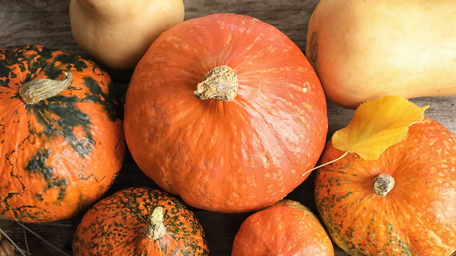
Traditional Thanksgiving colors come straight from autumn: pumpkin orange, warm brown, golden yellow, burgundy, maroon, and earthy green. They’re familiar for a reason. Together, they instantly make a room feel warm, festive, and ready for a holiday meal.
But there’s no official Thanksgiving color palette you have to follow. Sage and cream can feel just as seasonal as orange and brown, while terracotta, dusty blue, muted gold, and rich burgundy offer beautiful modern possibilities.
Choose colors that complement your home and make your gathering feel inviting. In the end, Thanksgiving isn’t about creating a perfect table. It’s about making a warm place for good food, familiar traditions, and the people gathered around it.
FAQs
Orange, brown, golden yellow, deep red, and earthy green are the traditional Thanksgiving colors. They reflect the warm shades found throughout autumn.
Cream, camel, rust, olive, burgundy, and brown coordinate beautifully for Thanksgiving. Rather than matching exactly, choose several complementary colors and let everyone wear a different combination.
Not quite. Thanksgiving usually features warmer, earthier colors such as pumpkin, mustard, cranberry, brown, and olive, while Christmas tends to use brighter red, evergreen, white, silver, and gold.